
Accessibility
KCC Accessibility Statement
Accessibility supports our college mission and reflects our belief that all members of our campus community—students, employees, and visitors—should be able to participate fully.
Our goal is simple: remove barriers before they appear and support equitable use for everyone. For many people, assistive tools such as screen readers, magnifiers, voice navigation, or keyboard-only controls are essential—not optional. When digital content is built correctly, these tools work smoothly. When it isn’t, basic tasks become unnecessarily difficult.
KCC follows the internationally recognized Web Content Accessibility Guidelines (WCAG) , created by the World Wide Web Consortium. These standards guide how we design and maintain access across our websites, documents, learning platforms, social media, multimedia, and other digital spaces.
What You Can Expect from Us
- We design digital materials that allow people using assistive technology to confidently engage with the college, prioritizing practical access.
- We apply WCAG Standards to our digital materials and regularly review content through structured accessibility checks.
- We offer clear ways to report barriers so issues can be addressed quickly and effectively.
- We provide ongoing training and support to employees responsible for creating and maintaining accessible content.
This page provides general guidelines and best practices for creating accessible digital content, including text, images, tables, links, and more. It can be applied across various software, platforms and technologies. To learn how to create accessible Word documents and PDF files, please visit creating accessible documents.
Contents
- Write accessible text
- Accessible structure using headings
- Using lists
- Accessible hyperlink text
- Create accessible tables
- Alternative text
- Use sufficient color contrast
- Accessible documents
- Accessibility checkers and other resources
Write accessible text
Readability
Text should be easy to understand for all users. Write so that people whose first language is not English or those with cognitive disabilities are able to understand. Avoid overly complex vocabulary and sentence structures. WCAG recommends writing text that can be understood at a lower secondary education level (9th grade or below).
"The efficacy of the programmatic initiative was significantly circumscribed by the deleterious effects of its obfuscated procedural paradigm."
The success of the program was limited by the negative effects of its confusing rules."
The Hemingway App (opens in new window) is a free tool that can help you reduce the complexity of your writing.
Another option is to prompt AI: “Rewrite this text so it's easy to understand for someone reading at a 9th-grade level or lower. Keep the original meaning and tone, and avoid complex vocabulary or sentence structures: (enter content)”
Avoid abbreviations
Screen readers may not read abbreviations correctly. To ensure that all users understand the content, spell out the abbreviations the first time they are used, followed by the abbreviation in parentheses. For example:
- NOAA as "National Oceanic and Atmospheric Administration (NOAA)".
- WHO as "World Health Organization (WHO)".
Write out the full date instead of using abbreviations.
Tue, Jan 13, 2025
Tuesday, January 13, 2025
Avoid symbols
Avoid using symbols in your text when possible. Some screen readers may not read symbols correctly or will omit them, which can lead to confusion.
For example, "2024-2025" can be read as "2024 dash 2025” or "2024 2025" or "2024 to 2025" depending on the screen reader software used.
Convey information in multiple ways
People with visual impairments or color blindness may have difficulty understanding information conveyed only by color or shape. Where possible, include text to ensure the information is conveyed in multiple ways.
"To reserve a seat in the training, use the green button. Use the red button to decline."

Someone with red-green color blindness will not be able to tell the difference between the two buttons.
"To reserve a seat in the training, use the green button. Use the red button to decline."

Hyperlinks are another example. Users with visual impairments may not be able to see the difference in color compared to surrounding text. Include an underline or other visual indicator to show that the text is a link. The default settings in most software will usually have underlined links, so avoid modifying the styles to remove the underline.
Font selection
Small font sizes and cramped character and line spacing can make text difficult to read for those with reading disabilities or vision impairments. Serif fonts can produce unnecessary visual clutter. The following tips can help improve text legibility:
- Use sans serif fonts like Arial, Calibri, Verdana, Century Gothic, etc.
- To match KCC branding, use Open Sans (open in new tab/window) for normal text and Roboto (open in new tab/window) and Oswald (open in new tab/window) for headings.
- Avoid small fonts:
- Font size for normal text should be 12-14 points.
- Avoid light/thin font weights.
- Do not use cursive fonts, those that mimic handwriting, or decorative fonts.
- Use bold for emphasis.
- Avoid condensed fonts. For example,
Papyrus Condensed has low letter spacing:

Open Sans provides better letter spacing:

Accessible structure using headings
Headings are used to create a logical structure for the content. They help organize the content and make it easier to navigate. Screen reader users can use headings to quickly jump to different sections of the content. It can help all users in scanning the content and quickly finding information. It's important to use a logical and sequential order when creating the document's heading structure.
Most of the time you should have only one heading 1 (H1) per page, which usually matches the title of the page or document. Your heading 2s (H2) should be the main sections of the content, and heading 3s (H3) should be subsections of heading 2s. Headings should be sequential and not skip levels. For example, do not skip from heading 1 (H1) to heading 3 (H3).
- Heading 1
- Heading 3
- Heading 2
- Heading 3
- Heading 1
- Heading 2
- Heading 4
- Heading 2
- Heading 1
- Heading 2
- Heading 3
- Heading 3
- Heading 2
- Heading 3
- Heading 4
- Heading 3
- Heading 2
Using lists
Lists are used to group related items together. They help break up large blocks of text and make it easier for users to scan the content. Use an unordered (bulleted) list when the order of items does not matter. Use an ordered (numbered) list when the order of items matters such as step-by-step instructions.
Unordered lists
Instructions:
- Preheat your oven to 375°F.
- In a large bowl, combine the softened butter, granulated sugar, and brown sugar mixing until light and fluffy.
- Beat in the eggs one at a time, then stir in the vanilla extract.
- In a separate bowl, whisk together the flour, baking soda, and salt.
- Gradually add the dry ingredients to the wet mixture, mixing until just combined.
- Stir in the chocolate chips.
- Drop rounded tablespoons of dough onto ungreased baking sheets.
- Bake for 9 to 11 minutes, or until the edges are golden brown.
- Let cool on the baking sheet for 2 minutes before transferring to a wire rack to cool completely.
Step-by-step instructions should be an ordered list since the order of the steps matters. A recipe's ingredient list is a much better candidate for an unordered list.
Ingredients:
- 1 cup (2 sticks) unsalted butter, softened
- ¾ cup granulated sugar
- ¾ cup packed brown sugar
- 2 large eggs
- 1 teaspoon vanilla extract
- 2 ¼ cups all-purpose flour
- 1 teaspoon baking soda
- ½ teaspoon salt
- 1 cup (or more!) chocolate chips
Ordered lists
Baking instructions are a great example of when to use an ordered list. Nested ordered lists can be used to detail the steps further.
Ingredients:
- Preheat your oven to 375°F.
- In a large bowl mix the sugar and wet ingredients:
- Combine the softened butter, granulated sugar, and brown sugar mixing until light and fluffy.
- Beat in the eggs one at a time.
- Stir in the vanilla extract.
- In a separate bowl, whisk together the flour, baking soda, and salt.
- Gradually add the dry ingredients to the wet mixture, mixing until just combined.
- Stir in the chocolate chips.
- Drop rounded tablespoons of dough onto ungreased baking sheets.
- Bake for 9 to 11 minutes, or until the edges are golden brown.
- Let cool on the baking sheet for 2 minutes before transferring to a wire rack to cool completely.
Accessible hyperlink text
A hyperlink, often just called a link, is a digital reference that allows a user to jump directly to another location, document, or resource. When creating hyperlinks, it is important to use descriptive link text that provides context about the link's destination. This helps users understand where the link will take them without needing to read the surrounding text.
- Do not use the web address in your link text because screen readers will read every character and symbol.
- Never use the word "link" in your link text.
It's redundant because screen readers automatically announce when they come across a link. - Avoid the word "click" (for example "click here...").
Screen reader and keyboard users often don't use a mouse and don't actually click on links. - Specify if the link opens in a new window/tab.
- When linking to a file, include the filesize in parenthesis at the end of the link text (for example "(PDF, 2MB)").
This is a curtesy for users with slow internet connections or limited data plans. - Type out email addresses.
This helps screen reader users know that the link is an email address and expect it to open their email client.
Click here to learn more about our college.
To log in to the learning managements system, click here.
Email us for help with the registration process.
Visit our website: https://www.kcc.edu/.
View the 2025 to 2026 academic calendar here.
Visit the Kankakee Community College website to learn more about our college.
Visit Canvas (opens in a new window/tab) to log in to the learning management system.
Email us at registration@kcc.edu for help with the registration process.
Visit the Kankakee Community College website.
Create accessible tables
Tables can be difficult to understand for screen reader users if they are not created properly. When you cannot see a table and it's being announced auditorily, it's easy to get lost in an overly complex table structure. Imagine trying to explain a table to friend over the phone who cannot see what you're looking at.
Complex tables can often be broken down into multiple simple tables.
Create simple tables.
A simple table has a single header row, no merged cells, and may have an optional header column.
Screen readers will usually announce the row position, column position, any header rows and header columns, and the cell contents. This gets confusing quickly in complex tables.
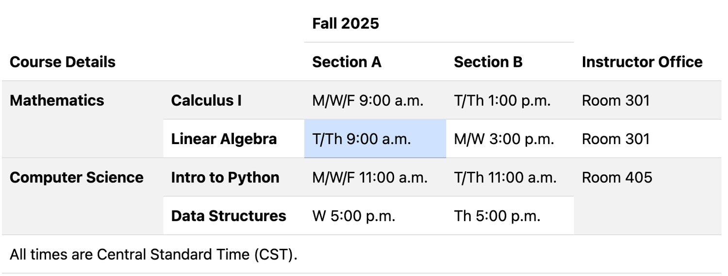
The following complex table example has multiple header rows, multiple header columns, and merged cells.
Semester Course Schedule and Instructor Details
This is a perfect example of a table that can be broken down into multiple simple tables.
It could be split into one table for the course schedule and another table for the instructor office locations.
In the complex example above, for the cell highlighted in light-blue (T/Th 9:00 a.m.), a screen reader would announce the following information: row 4, column 3, Fall 2025, Section A, Mathematics, Linear Algebra, T/Th 9:00 a.m.. This can quickly become overwhelming for users trying to understand the table.
The following two tables were created from the overly complex table above. They have only a single header row and no merged cells.
Fall 2025 Course Schedule
| Course Name | Section A Time | Section B Time | Department |
|---|---|---|---|
| Calculus I | M/W/F 9:00 a.m. | T/Th 1:00 p.m. | Mathematics |
| Linear Algebra | T/Th 9:00 a.m. | M/W 3:00 p.m. | Mathematics |
| Intro to Python | M/W/F 11:00 a.m. | T/Th 11:00 a.m. | Computer Science |
| Data Structures | W 5:00 p.m. | Th 5:00 p.m. | Computer Science |
Instructor Office Locations for Courses
| Course Name | Instructor Office Location |
|---|---|
| Calculus I | Room 301 |
| Linear Algebra | Room 301 |
| Intro to Python | Room 405 |
| Data Structures | Room 405 |
By breaking down the complex table into two simple tables, it becomes much easier for screen reader users (and everyone else) to understand the information being presented.
Alternative text
Alternative text, also known as alt text, is a brief description of an image or graphic. It is used by screen readers to provide context for users who cannot see the image.
Images can add meaning and context to your content as well as visual interest. However, if the images are not accessible, they can create barriers for users with visual impairments. Alt text helps make images accessible by providing a textual description of the image.
Do not use the word "image" or "picture" in your alt text. It becomes redundant because screen readers automatically announce that it is an image.
How the image is used in the content determines the type of alt text you should provide.
- A functional image provides a function and can act as a button or link.
- An informative image communicates information.
- A decorative image does not add meaningful information but is purely aesthetic.
Images of text should be avoided. It's best to use actual text instead of an image of it. If your graphic must contain text (for example a banner with a photo background and a text overlay), include it in the alt text.
Functional images
The alt text for a functional image should describe its purpose or function. A common example of a functional images is a logo that acts as a link to a homepage.
With the KCC logo below (which links to the KCC homepage) you may be tempted to use alt text like "KCC logo" or "Kankakee Community College logo." Instead, the alt text should describe what the link or button does.
Text like “Go to the Kankakee Community College website” would be great alt text as it tells the user what will happen if they click the image.
Another example of a functional image is an icon used as a print or download button. The alt text should describe the action that will occur when the button is activated.

- Print icon
- Icon of a printer
- Download icon
- Icon of a downward arrow with a line under it
- Print this page
- Print the PDF document
- Download the 2025 academic calendar (PDF, 204KB)
With a download button you should include the file type and size in the alt text.
Informative images
An informative image brings meaningful information to your content. Alt text for these types of images should be concise yet descriptive enough to convey what they are adding to the content or page. Imagine yourself giving a brief description of an image to a friend over the phone who cannot see it.
Here are some good examples of alt text for the image below:
- A student with a laptop
- A smiling student sitting in the library with a laptop

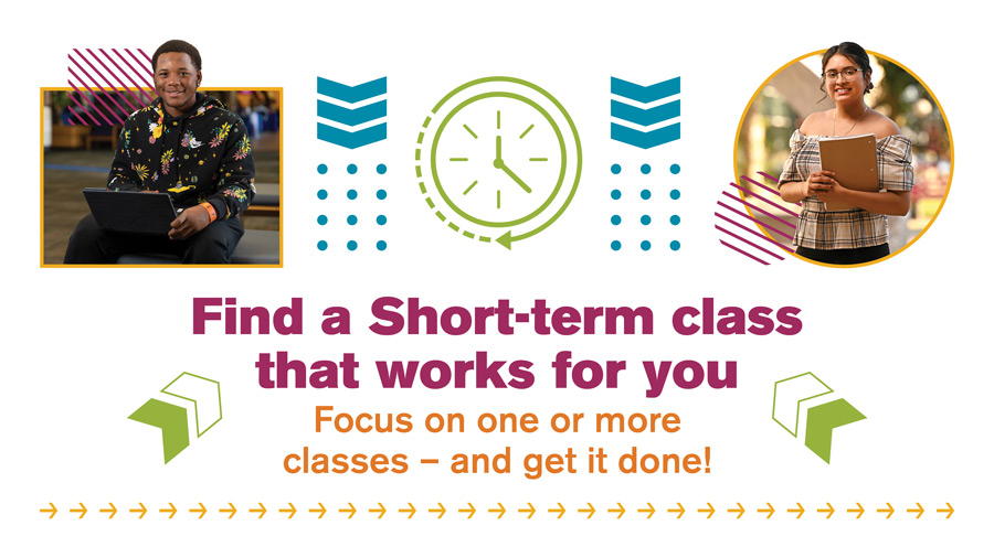
For the banner below, a good example of alt text would be:
- Find a short-term class that works for you. Focus on one or more classes — and get it done!
Decorative images
Decorative images do not convey meaningful information and are used purely for visual enhancement. A good rule-of-thumb for determining if your image is decorative is to ask yourself, "If this image were removed, would the meaning of the content change?" If the answer is no, then the image is likely decorative. Background graphics are a good example of decorative images.
For decorative images, you can either provide empty alt text or mark them as decorative. If your software allows you to mark an image as decorative, use that option. Otherwise, provide empty alt text.
Use sufficient color contrast
Having sufficient color contrast is essential for readability and accessibility. If text does not provide enough contrast against its background, it can be difficult for users with color blindness or visual impairments to read.
The contrast between two colors is measured as a ratio. The higher the contrast ratio, the easier the text is to read. WCAG 2.1 AA requires a minimum contrast ratio of 4.5:1 for normal sized text.
The easiest way to check color contrast is to use a color contrast checker tool. These tools allow you to enter the foreground (text) and background colors and will calculate the contrast ratio for you and usually provide guidance on whether the contrast meets accessibility standards. Colors are usually input as HEX or RGB color codes in these tools. If you're unsure of the color codes, there are free tools and browser plugins available. Just Color Picker (opens in new window) is a free color picker tool for both Windows and Mac that allows you to easily sample color codes on your screen.
The following are some free color contrast checker tools:
- Our WCAG Color Contrast Checker page.
- AudioEye® Color contrast checker (opens in new window)
- Deque University color Contrast Analyzer (opens in new window)
Accessible documents
Documents published online need to be accessible too. This includes Word®, Excel®, and PDF files.
Learn how to create accessible documents.
Accessibility checkers and other resources
Accessibility checker software, tools, and plugins can help you create accessible content. However, it is important to remember that these tools are not perfect and cannot catch all accessibility issues. Some accessibility concerns require manual review and testing to ensure that the content is truly accessible. For this reason, it is important to have a good understanding of accessibility principles when using them.
- Microsoft's Accessibility Checker (opens in new window) is built into Microsoft Office applications such as Word, Excel, and PowerPoint.
- Grackle Accessibility Checker (opens in new window) is a browser plugin for Google Docs.
- axe DevTools - Web Accessibility Testing (opens in new window) is a Chrome accessibility checker extension (also available for other browsers).
- WAVE Browser Extensions (opens in new window) allows you to evaluate web content for accessibility issues directly within your browser.
- How to use the WAVE extension and start manual accessibility testing (opens in new window) is a great resource for learning how to use the WAVE browser extension.
Here are some additional resources to help you learn more about web accessibility: